Design & Brand Identity
Responsive E-Commerce Website for The Korean Skin Care Company Kiseu.
The brand’s name is derived from the direct Korean translation for “kiss”. The act of kissing may also be deemed as a ritual and formal gesture, depending on context and culture. The Korean skin care routine contains 5-10 different products and builds up to a daily ritual.
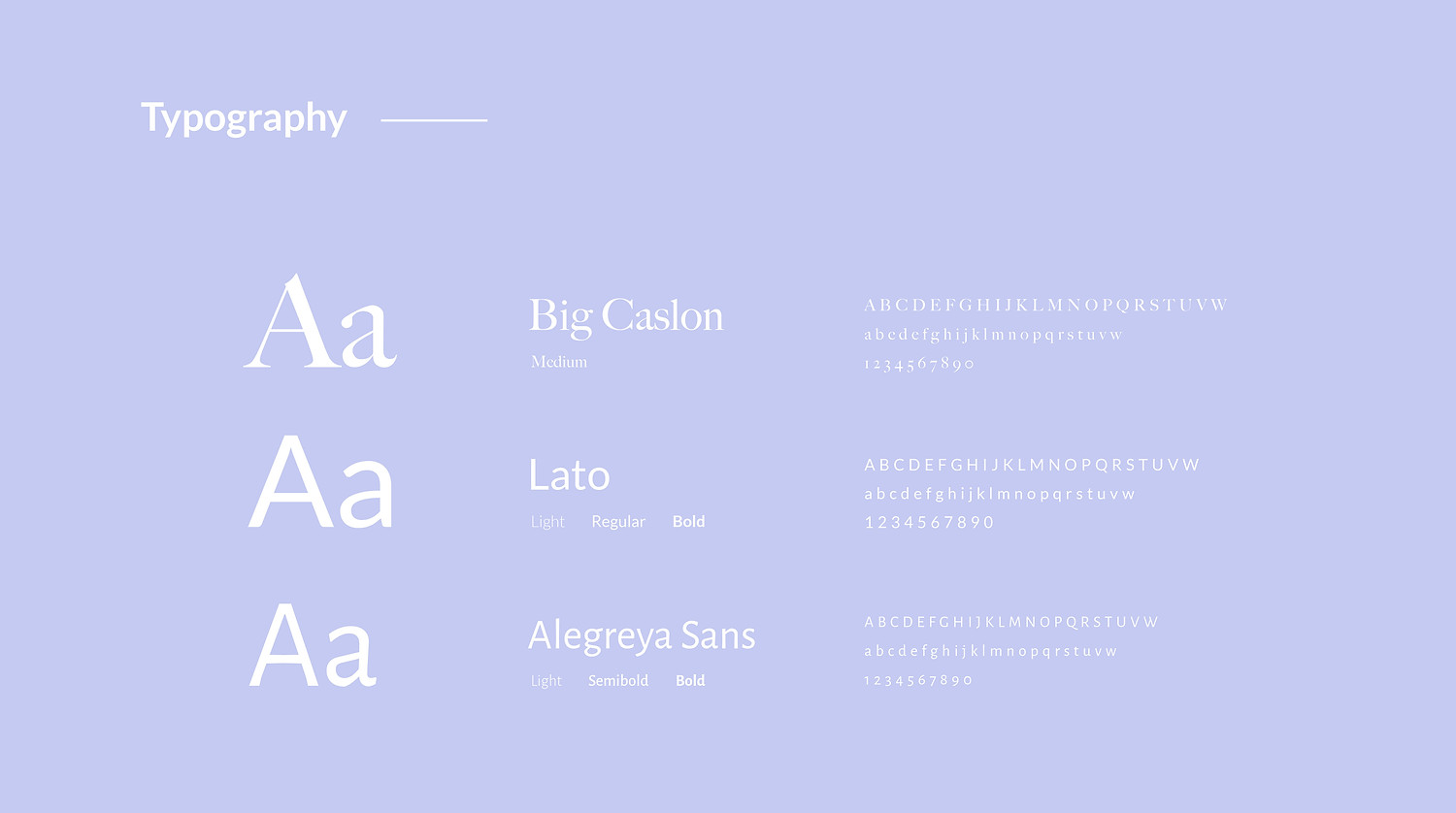
Considering the brand’s identity, I created a natural and spa look to represent the values that the brand is based on. This includes a visual concept with a natural and pure tone. I used pictures of women with a natural look, little or no makeup, bright and clean images.
Client
Kiseu is a new Korean skin care beauty brand.
Project Goal
Creating a new website, including blog and shop as well as implementing a cross functional visual concept for all social media channels.
Business Goal
Increasing the brand awareness and the brand popularity as well as selling the products online. From wordpress' rigid look to a full screen responsive appearance.
Role
Art direction, conception, design
Year
2019